OlaWell
Startup
Life Sciences
About the Project
As we mentioned earlier OlaWell is a startup company. This means that we had all the freedom but also all the responsibility to create a simple, usable and cross-platform compatible design that will help OlaWell users to better understand their gut microbiome, and provide them with actionable information that can help them to change their food eating habits to improve their gut microbiome balance. There were many design challenges that we had to solve to achieve these goals and create a user interface that will add value to the user experience.
In close cooperation with the client, we developed a graphic user interface for the marketing website and user account portal. To do this we went through an iterative process of designing and reviewing each specific product feature. While designing we followed the main principles of simplicity, functionality and best practices. Usability tests were conducted as well as A/B tests. Based on these information designs has been modified and validated. We still work with the client on further service development and improvement.
Challenges
-
Help the client to define customer profile, understand their problems, needs, and behaviors related to their eating habits and gut microbiome health
-
Create simple UI that will help users to have a positive experience with the product
-
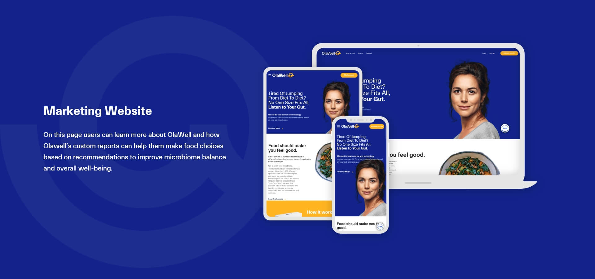
Create a marketing website which looks and works seamlessly across different devices and platforms
-
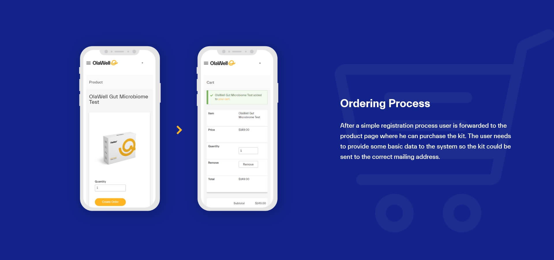
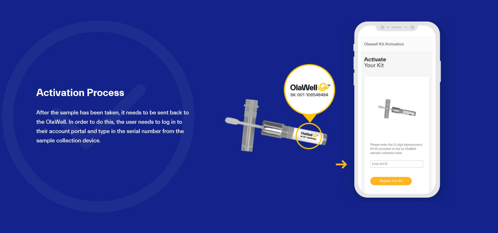
Design kit ordering/activation process as simple as possible
-
Design and create account portal user interface that looks and works seamlessly across different devices and platforms with the user in mind in the first place (user-centric design)
-
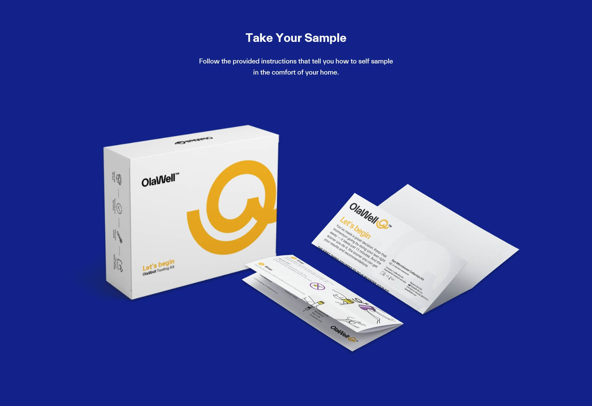
Create packaging design and instructions letter, on how to take a sample, that is easy to understand and follow
-
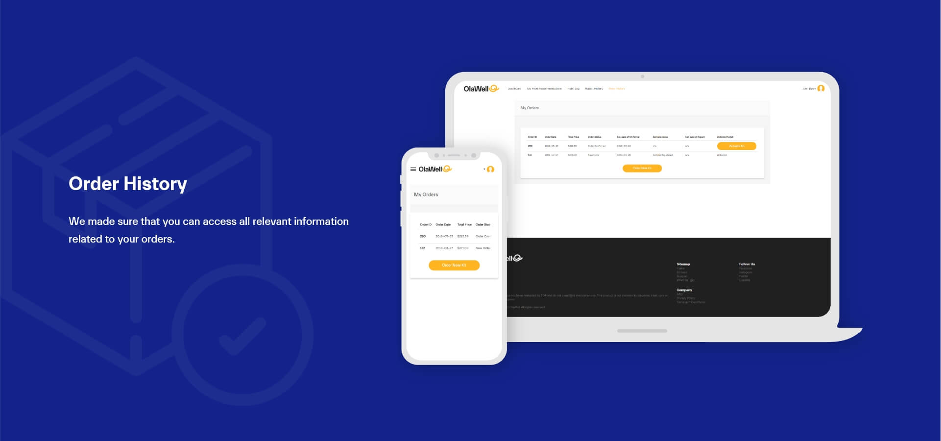
Give user ability to access to all necessary information related to their order/s status
-
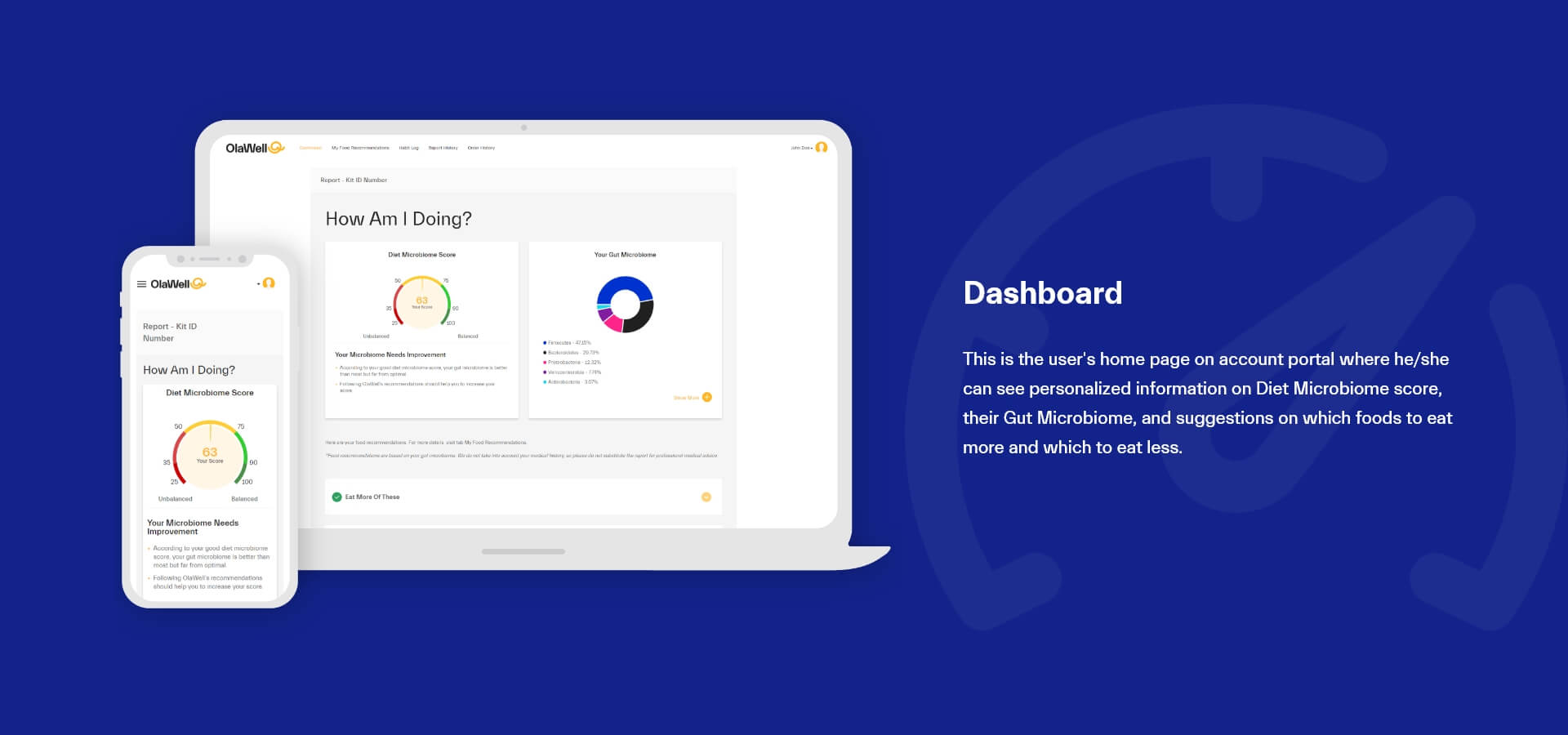
Deliver report information in easy to understand visual representation
-
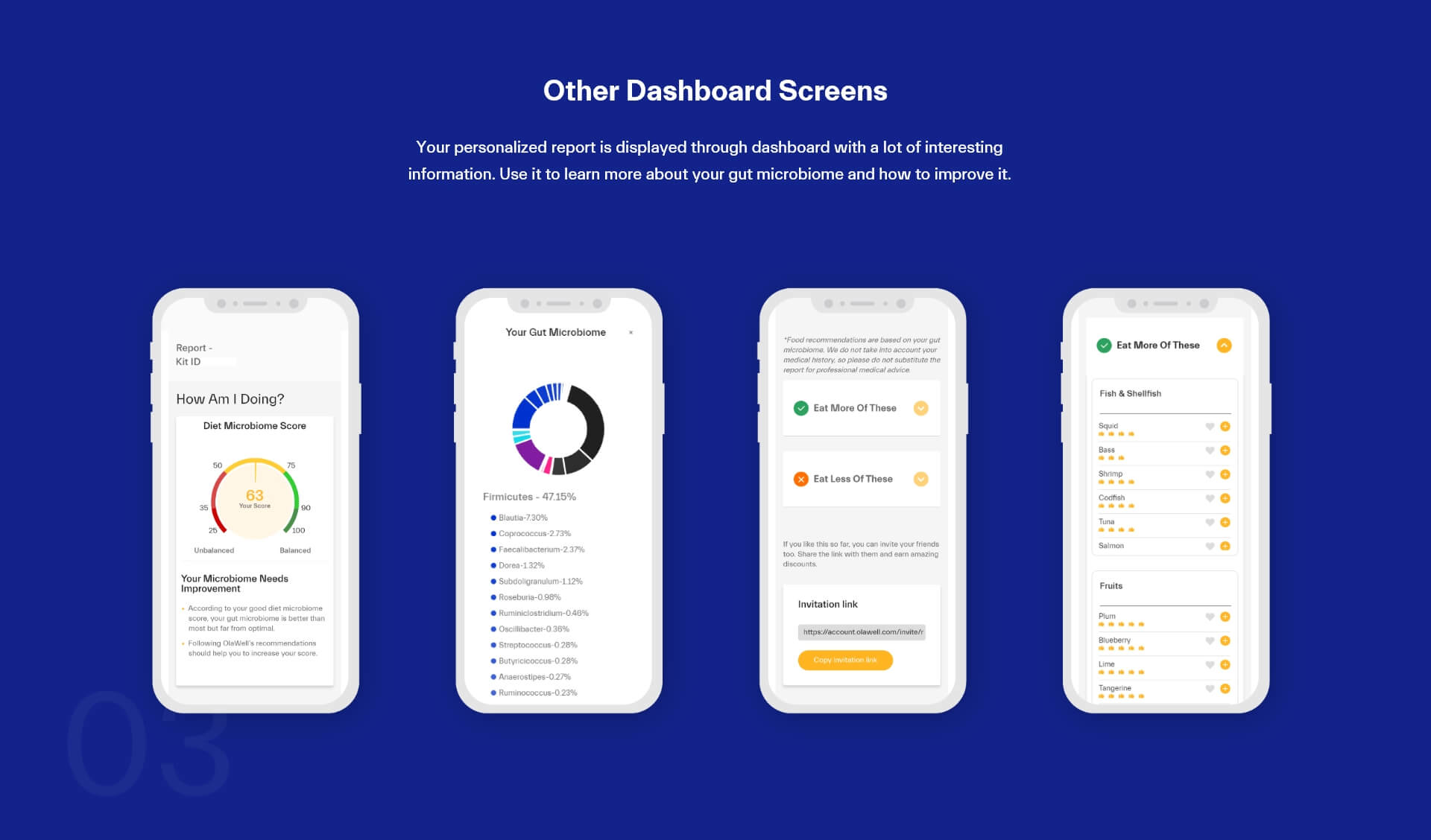
Give the user easy to understand visual representation of their gut microbiome
-
Give user necessary information on each bacteria type that they have in their gut microbiome
-
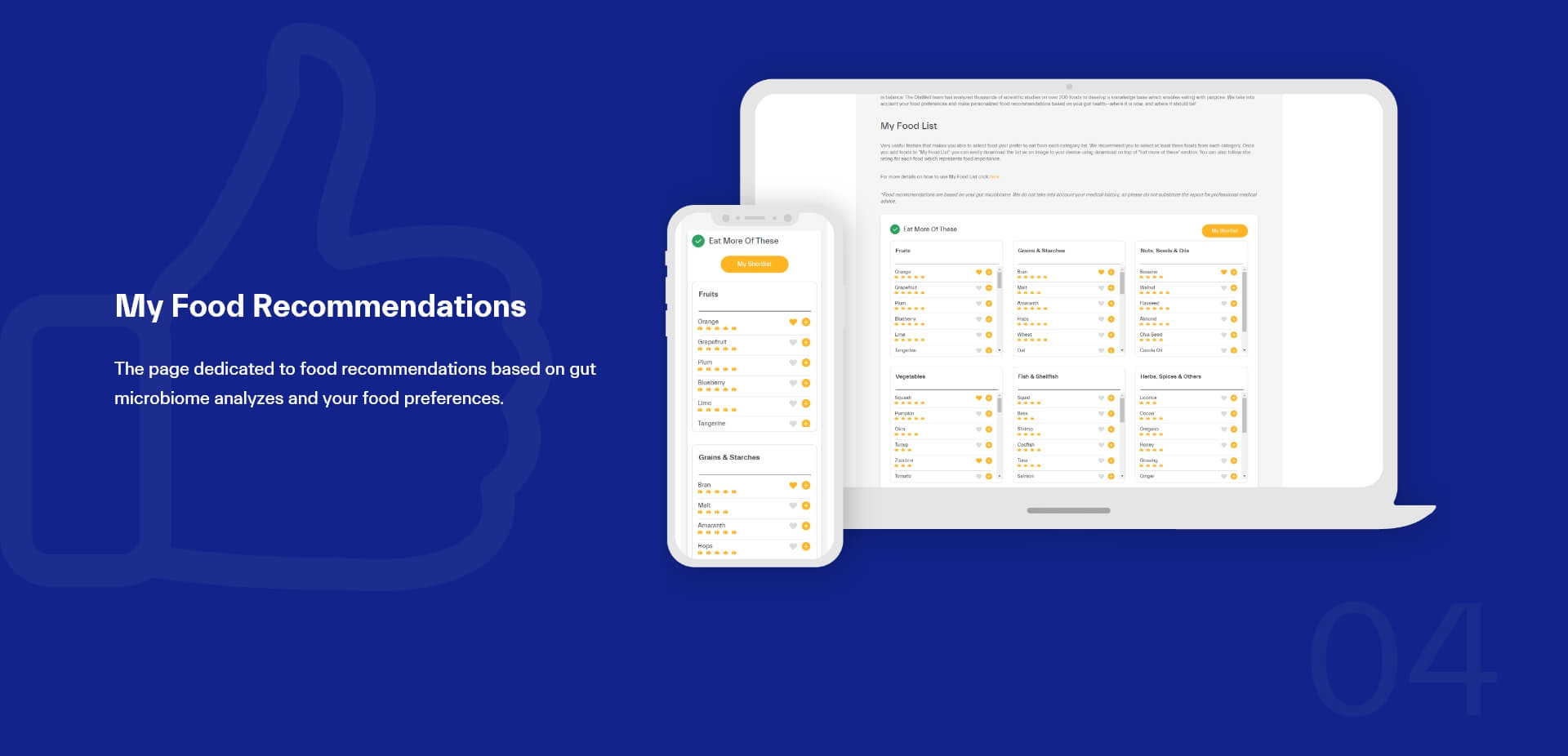
Create an easy to understand a way to represent foods that users should eat more or less in the future.
-
Design intuitive and simple visual representation of users’ diet microbiome score that is easy to read and understand.
-
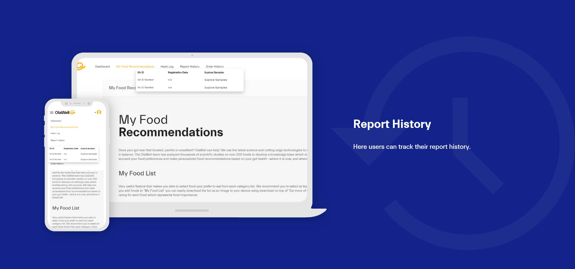
Create the possibility for the user to easily access their report on any device at any time
-
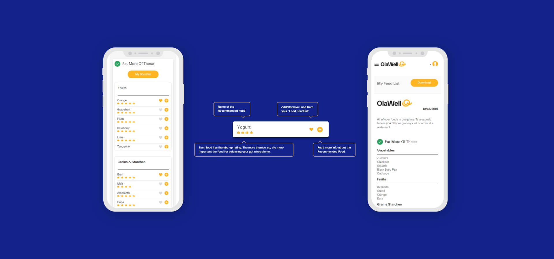
Give an option to the user to create their list of preferred foods, from the “Eat more of these” list of foods which is created based on information from the report on your microbiome score and information about your food habits.
-
Give user actionable information that he can access at any time at any device
-
Give user ability to share their experience/knowledge about OlaWell with their friends and family
-
Give user ability to learn more about each specific food, and how eating this food can affect their gut microbiome
-
Give user ability to track their food eating habits
-
Give user ability to be able to order and submit more than one sample to track their Diet Microbiome Score progress
Research
- Stakeholder interviews
- User interviews
- Competitor analysis
UX
- Development of 3 personas
- User journey map
- Wireframing
- Prototyping
- Iterations, improving, validating
UI
- Screen designs
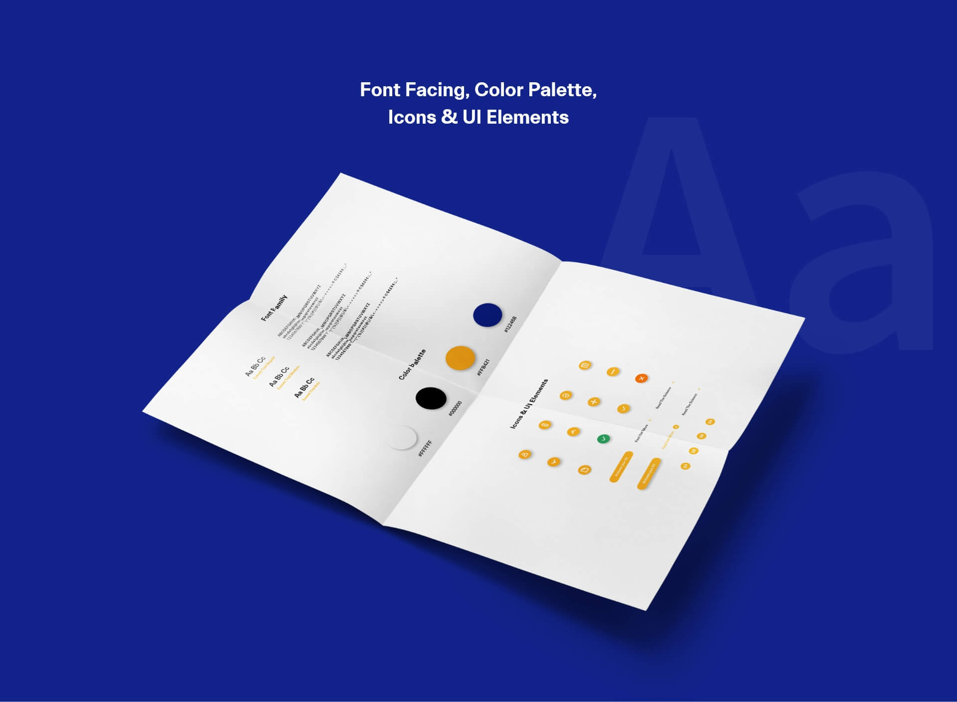
- Styleguide
- Exporting assets for development
Active Science
Previous Case Study


